The Howling Fantods

David Foster Wallace News and Resources Since March 97

  • Increase font size
  • Default font size
  • Decrease font size
Home News by Category The Pale King Pale King Cover Comparison

Pale King Cover Comparison

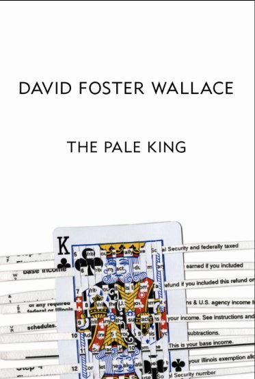
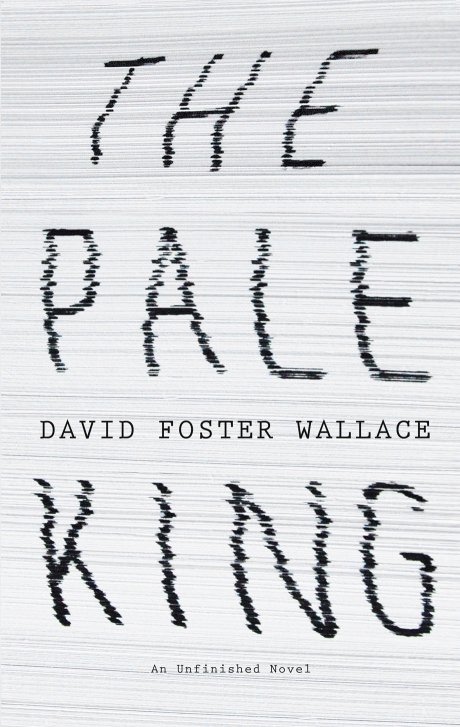
So which cover of David Foster Wallace's The Pale King do you prefer? The US edition cover (the playing card) is designed by David Foster Wallace's widow, artist Karen Green (check out her work at www.beautifulcrap.com, I'm particularly fond of the machines series, and Here/Gone: An ABC Flip Book For Grown Ups looks interesting). The UK edition (stack of papers) is designed by Jon Gray (one of my favourite cover designers) and is a completely different take.
 
Which do you like best? Why? Hit up the comments below.
 
 
I thought this would be a good opportunity to let you all know that I've worked out the issue to do with confirmation emails not appearing for those of you trying to register. I use a spam block email address (due to a spam attack last year), so if you use gmail, yahoo mail, hotmail etc. then the confirmation might get forwarded to your spam folder. Check there! If you remember your username and password I've automatically enabled some of you who signed up recently. Otherwise, let me know, and I'll fix your account.
 
 
Share
Last Updated on Friday, 17 September 2010 11:09  

Comments 

 
#1 kwinkler 2010-09-17 19:44
Karen's cover. By far. Not just b/c of who she is, although that is a bonus. But because it gives me more of a mental picture. Something to muse while I wait for the book. Covers, for me, should allude to something further in the story. The playing card makes me wonder if there is anything having to do with cards in the book, or if she just used it because it had a king on it. Though, the way she weaved the Illinois Tax Returns forms through it was pretty cool.

Gray's is interesting, but doesn't tweak my beak, as it were. Maybe if the shot were less zoomed in and we saw the title and DFW's name on a giant stack of papers on a desk. That would be stimulating.
Quote | Report to administrator
 
 
#2 JoshW 2010-09-17 20:24
Seconding Karen's. Purely an aesthetic response though; it's just prettier to look at. I appreciate Gray's more for its layered references (tax forms, DFW's discovered ms.) and how it visually represents the stratified office tedium Lane Dean Jr., um, enjoys.
Quote | Report to administrator
 
 
#3 rome8180 2010-09-18 12:11
I think I have to vote for Karen's. Agree with Josh that it is aesthetically more appealing, though conceptually I like Gray's more.
Quote | Report to administrator
 
 
#4 Nikki 2010-09-19 18:03
I liked Jon's cover, simply because I think it will probably represent the verbosity of the piece much better than any other cover. But it's very much the same sort of cover as a lot of other books.

So I actually like Karen's better, although I didn't in the beginning. I thought there was too much white space up the top and was very boring.. but looking at it in detail and comparing it to excerpts of the actual book, it actually suits it a lot more.
Quote | Report to administrator
 
 
#5 renniche 2010-09-27 01:39
I actually kind of like Jon Gray's better. Is there a higher-res version of Karen Green's cover?

I think I might buy both the American and the UK versions, actually.
Quote | Report to administrator
 

The Howling Fantods